Playing with Pandemic Models
In this topical notebook, I wanted to explore modelling our ongoing pandemic. Recently, there has been some discussion about whether top down lockdown rules are necessary. One counter argument I see is that once the general public is well informed about the virus, we can expect them to reduce social interaction voluntarily. With this in mind, we would like some way to measure whether this reduction is sufficient.
Before starting, I will add the caveat that I know almost nothing about epidemiology. As a result, most of what is presented here is probably wrong, but fun nonetheless. To emphasize this point, we'll use the xkcd plot style:
from matplotlib import pyplot as plt
plt.xkcd()
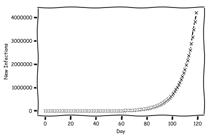
Let's start with a simple model of the virus. We'll have our model run for 120 days. We're going to use a magic $R_0$ value here, which will simulate the exponential growth behavior we want. Note that this is different than the real value, it is a per day growth factor not the average number any individual spreads it to. We'll start our model with 50 cases.
total_days = 120
days = list(range(0, total_days))
r0 = 1.10
starting_cases = 50
Now compute and plot the number of infections.
cases = [starting_cases]

for i in range(1, total_days):
    cases.append(cases[i-1]*r0)

fig, axs = plt.subplots(1, 1)
axs.plot(cases, 'kx--')
axs.set_xlabel("Day")
axs.set_ylabel("New Infections")
Imagine that we implement some sort of policy which changes the $R_0$ value to something new. We'll flip the switch at day 60.
from copy import deepcopy

switch = 60
rnew = 0.9

model1 = deepcopy(cases)
for i in range(switch, len(cases)):
    model1[i] = model1[i-1]*rnew

fig, axs = plt.subplots(1,1)
axs.plot(model1, 'kx--')
axs.set_xlabel("Day")
axs.set_ylabel("New Infections")
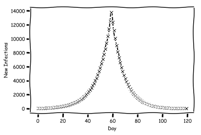
That's looking much better. But we don't want to study the number of cases, because this is very difficult to directly measure. Instead, we will study the number of deaths. In our model, we will assume that everyone who gets sick dies. Now we want to produce a plot of deaths per day. To do so, we need two variables: the average days to die since getting a case, and the standard deviation. Let's pick 20 days as the average, and 3 as the deviation.
mean = 20
deviation = 3
We want to combine this information to predict deaths per day.
def compute_deaths(model):
    from numpy.random import normal
    deaths_per_day = [0 for x in range(0, total_days*2)]

    for d, i in zip(days, model):
        dist = normal(mean, deviation, int(i))
        for v in dist:
            deaths_per_day[int(v)+d] += 1

    return deaths_per_day
Plot this and see what the shape is.
deaths_per_day = compute_deaths(model1)

fig, axs = plt.subplots(1, 1)
axs.plot(deaths_per_day[:total_days], 'kx--')
axs.set_xlabel("Day")
axs.set_ylabel("Deaths Per Day")

axs2 = axs.twiny()

ticks = {x: "" for x in range(0, total_days+int(total_days/6), int(total_days/6))}
ticks[switch] = "Lockdown"
ticks[switch + mean] = "Lockdown+Mean"

axs2.set_xticks(list(ticks.keys()))
axs2.set_xticklabels(list(ticks.values()), rotation='vertical')
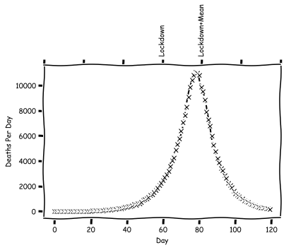
So in this model, we end up with a peak number of deaths 20 days after the lockdown. Let's consider a second policy, which will correspond to a voluntary lockdown. For this, we'll pick some medium size $R_0$ to switch to.
rsoft = 1.05
switch_soft = 50

model2 = deepcopy(cases)
for i in range(switch_soft, len(cases)):
    model2[i] = model2[i-1]*rsoft

deaths_per_day2 = compute_deaths(model2)

fig, axs = plt.subplots(1, 1)
axs.plot(deaths_per_day2[:total_days], 'kx--')
axs.set_xlabel("Day")
axs.set_ylabel("Deaths Per Day")

axs2 = axs.twiny()

ticks = {x: "" for x in range(0, total_days+int(total_days/6), int(total_days/6))}
ticks[switch_soft] = "Soft Lockdown"
ticks[switch_soft + mean] = "Soft Lockdown+Mean"

axs2.set_xticks(list(ticks.keys()))
axs2.set_xticklabels(list(ticks.values()), rotation='vertical')
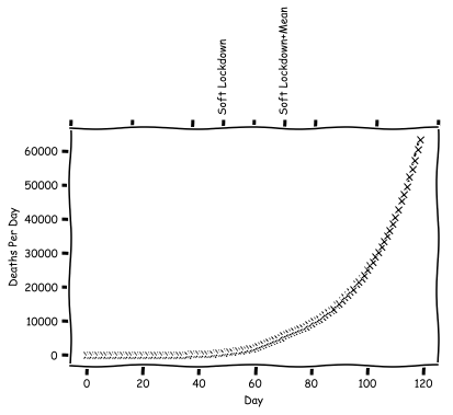
In fact, with the soft lockdown it is not so easy to see the effect. Now for our real goal. What happens if we do a two staged approach? In the first stage, the public begins hearing that the virus is going around. They start to worry, and begin changing their behavior, modifying the $R_0$. Then the actual lockdown happens, and the $R_0$ is modified again. What does this plot look like?
model3 = deepcopy(cases)
for i in range(switch_soft, len(cases)):
    model3[i] = model3[i-1]*rsoft
for i in range(switch, len(cases)):
    model3[i] = model3[i-1]*rnew
deaths_per_day3 = compute_deaths(model3)

fig, axs = plt.subplots(1, 1)
axs.plot(deaths_per_day[:total_days], 'kx--', label="Hard Only")
axs.plot(deaths_per_day3[:total_days], 'r.--', label="Two Stage")
axs.set_xlabel("Day")
axs.set_ylabel("Deaths Per Day")

axs2 = axs.twiny()

ticks = {x: "" for x in range(0, total_days+int(total_days/6), int(total_days/6))}
ticks[switch] = "Lock Down"
ticks[switch_soft] = "Soft Lockdown"
ticks[switch + mean] = "Lockdown+Mean"
ticks[switch_soft + mean] = "Soft Lockdown+Mean"

axs2.set_xticks(list(ticks.keys()))
axs2.set_xticklabels(list(ticks.values()), rotation='vertical')
axs.legend()
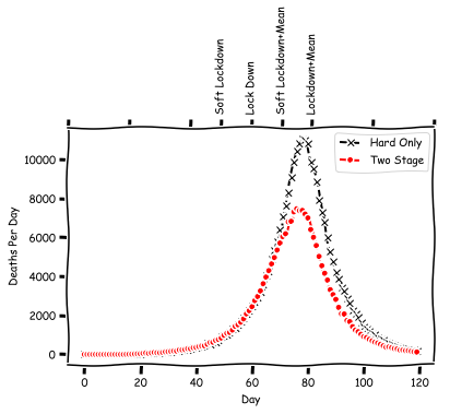
Indeed in this two stage model the deaths have been reduced. However, we don't really see much other evidence that something has happened, as the peak didn't move all the way back to the soft lockdown + mean location. We can repeat this study once more, but this time using a lower value of $R_0$ for the soft lockdown.
rsoft2 = 1.0
model4 = deepcopy(cases)
for i in range(switch_soft, len(cases)):
    model4[i] =model4[i-1]*rsoft2
for i in range(switch, len(cases)):
    model4[i] = model4[i-1]*rnew
deaths_per_day4 = compute_deaths(model4)

fig, axs = plt.subplots(1,1)
axs.plot(deaths_per_day[:total_days], 'kx--', label="Hard Only")
axs.plot(deaths_per_day4[:total_days], 'r.--', label="Two Stage")
axs.set_xlabel("Day")
axs.set_ylabel("Deaths Per Day")

axs2 = axs.twiny()

ticks = {x: "" for x in range(0, total_days+int(total_days/6), int(total_days/6))}
ticks[switch] = "Lock Down"
ticks[switch_soft] = "Soft2 Lockdown"
ticks[switch + mean] = "Lockdown+Mean"
ticks[switch_soft + mean] = "Soft2 Lockdown+Mean"

axs2.set_xticks(list(ticks.keys()))
axs2.set_xticklabels(list(ticks.values()), rotation='vertical')
axs.legend()
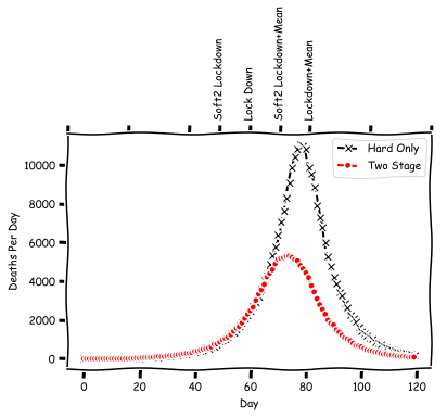
In this case, the lockdown peak has shifted much further back. So from this exercise, what we have (maybe?) learned, is that: 1) everyone's voluntary social distancing may help quite a bit, even if that alone is not enough ; 2) depending on how impactful it is, we may be able to see it in a shifted peak, but this is not guaranteed.